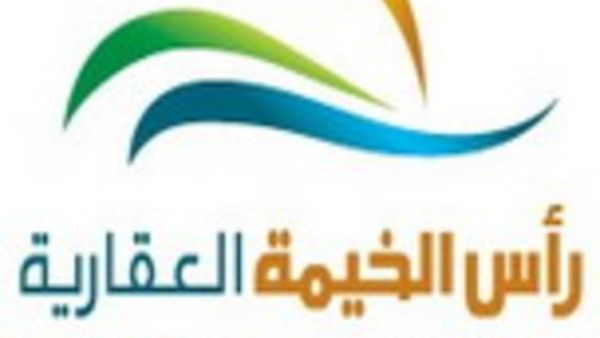
RAK Properties, the premier real estate development company of Ras Al Khaimah, unveiled its company logo that depicts its corporate identity. The logo of RAK Properties is a representation of the company’s distinctive status.
“The logo portrays the unique identity of the company and its ambitions to take the emirate from regional to an international platform. The mission of RAK Properties is to support the promising vision of RAK government towards the development of real estate, tourism and leisure facilities in Ras Al Khaimah”, said Mohammed Sultan Al Qadi, Managing Director and CEO, RAK Properties.
The logo consists of three colours that resembles the basic elements of nature that compliment the emirate’s positioning. The yellow streak symbolises the sun, the blue streak represents the sea that is undoubtedly the main attraction in RAK. Finally, the green streak depicts the widespread plantation that offers scenic and agricultural benefits to the emirate.
The combination of all the colours in the logo is a clear indication of the harmony between the elements of nature to help view RAK as a beautiful landscape. The extension of these streaks towards the horizon illustrates the company’s aims that will be ambitiously achieved through its future projects.
The unique geographical position that the emirate enjoys, by being in the heart of the Middle East and surrounded with magical nature is a definite benefit for the emirate. “Our aim is building closer to nature, RAK Properties will ensure to preserve the natural beauty in its existing form and yet execute its project with a vision to compliment the Mother Nature” concluded, Al Qadi.


