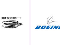
9. Boeing : The original logo of the company was designed in the 1920s and was composed of three different badges. The first one was a detailed image of the bird, flying to the East, with an arrow above it, where the wordmark was located. It was a symbol of speed and freedom. In 1997 Boeing merged with McDonnell Douglas company and the logo was redesigned, combining visual identities of both companies. The strong logotype adopted an elegant and unique emblem, a circle with a stylized wing on its right and a ring around it. The current logo is executed in a blue and gray color palette, where the blue is used for the lettering and gray for the emblem, the combination of colors perfectly reflects the company’s essence and nature, symbolizing air, speed, and safety.


, a fitting reference for a tech company.")


, a fitting reference for a tech company.")


")
 meeting with Israel's Prime Minister Benjamin Netanyahu (L) on the sideline of 78th United Nations General Assembly at UN headquarters in New York City. AFP")